Print Design & Production
Promotional Brochures
|
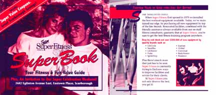
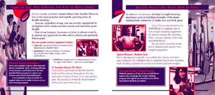
Print Design & Production
|
||
|
Promotional Brochures
|
||
|
|
|||||||||||||||||||||||||||
|
|||||||||||||||||||||||||||
|
|
||||||||||||||
|
||||||||||||||
|
||||||||||||||
|
|
||||||||||||||||||||||||||
|
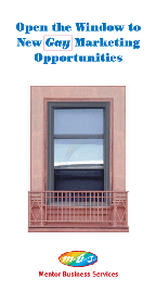
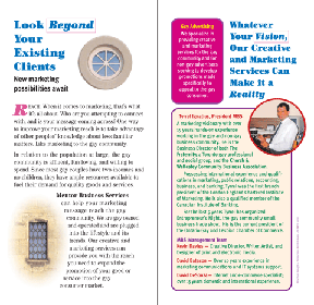
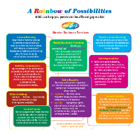
Mentor Business Services
|
||||||||||||||||||||||||||
|
||||||||||||||||||||||||||
|
Overview
|
||||||||||||||||||||||||||
| The client who commissioned this brochure, Mentor Business Services, is engaged in marketing an assortment of business services to entrepreneurs in the gay community.
Concept, Graphic Design, Writing, Logo Design, Layout & Production |
||||||||||||||||||||||||||
|
|
||
|
This page was last updated September 11, 2004
Content copyright © 1980 to 2004 by Kevin Davies. All rights reserved. |
||